Georgia Bird Alliance
LMS Instructor Dashboard
Note: Personally Identifying Information (PII) has been redacted from this case study. All names and data are placeholders.
Go to RoostLMS.com to see the interactive prototype. This will open in a new browser tab.
My Role
Lead Product Designer
(Strategy, UX/UI, Research)
Context: Flying Blind
The Pain Point
Instructors had no visibility into who was struggling or where they were getting stuck. Without performance data, they couldn't reach out to students, making the LMS a stagnant reference guide rather than an active learning tool.
Helping the Georgia Bird Alliance scale their online education program by automating student performance tracking.
Team
1 Designer and 2 Program Managers
Timeline
3 Weeks
Key Outcome
Increase course completion by 40%
Thanks for reading!
The Business Trigger: High Hype, Low Engagement
The Disconnect
Members of the Georgia Bird Alliance (BGA) were very excited about a new e-learning platform. Initial signups were very strong, but the organization quickly realized the platform wasn’t retaining many users. Leadership needed to understand the drop-off to justify the ongoing resource cost and validate the tool's long-term value.
The User Reality: No Visibility
Members of the Georgia Bird Alliance (GBA) were very excited about a new e-learning platform. Initial signups were very strong, but the organization quickly realized the platform wasn’t retaining many users. Leadership needed to understand the drop-off to justify the ongoing resource cost and validate the tool's long-term value.
The Data
Analytics showed students began courses but dropped off after completing fewer than two modules.

Insight: The “Aggregation Trap”
Existing Metrics
These were "vanity metrics." They told us that students were not engaged, but didn’t tell us why.
The Discovery
I conducted interviews with three course instructors to understand their workflow. The feedback was consistent: they weren't just frustrated by low engagement, they were concerned with creating more content that would yield the same outcome.
The Pivot
An audit of the existing reporting tools revealed the core issue. The system only provided high-level averages of time spent logged in, module completion rates, and average quiz scores. All of these metrics were grouped together and could not be filtered.
The Strategic Shift:
We realized the dashboard shouldn't provide only grouped average metrics, but we needed more insight to evaluate the content effectiveness. We had to shift our mindset from “How are students doing?” to “Where is the content lacking?”
Solution: Designing for Outcomes
The Execution
The final dashboard moved beyond generic metrics to focus on positive learning outcomes. We designed two core views to empower instructors:
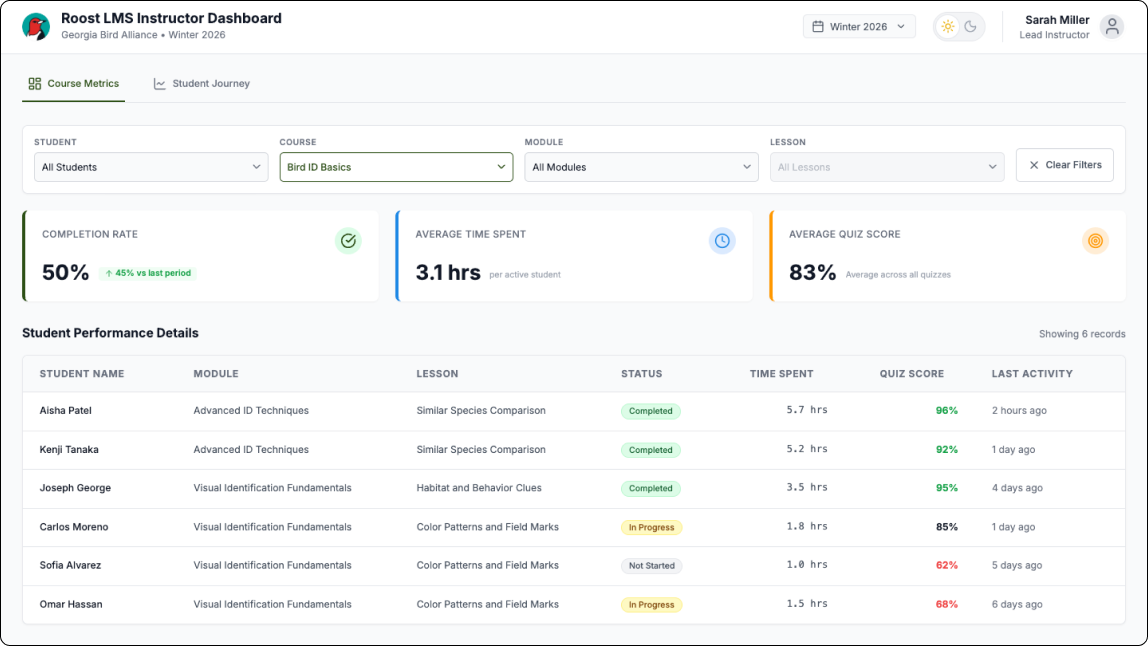
Course Metrics with Filterable Data
To solve the "aggregation trap," we built more specific filtering, allowing instructors to filter down data by Student, Course, Module, and Lesson. This allowed them to determine whether a drop-off was a single-student issue or a pattern across the entire class.
Student Retention Journey Graph
We designed this graph so instructors could quickly see where in the course students were dropping off. Instructors can use the filters to change the view of the graph to get a clear picture and gain insights about where and why students are dropping off. This highlighted potential issues in the curriculum, allowing instructors to see exactly where students were abandoning the course rather than just knowing that they left.
Solution: Designing for Outcomes
By shifting the focus from generic reporting to actionable insights, the instructors had the data they needed to ensure that the LMS was a valuable tool for the organization.

Completion rates increased from 15% to 60%
We designed this graph so instructors could quickly see where in the course students were dropping off. Instructors can use the filters to change the view of the graph to get a clear picture and gain insights about where and why students are dropping off. This highlighted potential issues in the curriculum, allowing instructors to see exactly where students were abandoning the course rather than just knowing that they left.
Content Optimization
Instructors now had the information that ensured they developed content that was both valuable and accessible to make sure students were able to stay engaged in their learning journey.