UX DESIGN CASE STUDY
Re-designing an Automation Process the Right Way
| My Role: | Lead UX Designer - sole contributor across research, design, and production validation |
| Company: | The Home Depot |
| Project: | Pro Quoting Tool - Bulk Upload Feature |
| Timeline: | 10 weeks, discovery to ship |
| Methods: | Contextual inquiry, job shadowing, iterative design, UAT, GitHub validation |
| Deliverables: | Figma prototype, dev handoff, production validation in sandbox environment |
The Challenge
The Home Depot's complex quoting team handles large, multi-line jobs for professional contractors - quotes that could run 50, 60, sometimes 80 line items across categories like lumber, flooring, and electrical. To manage the volume, they relied on an automation bot built by another team.
The bot worked by taking control of the user's machine to enter line items automatically. A stray mouse movement could crash the entire process and force a restart from scratch. Two weeks of direct shadowing surfaced the deeper problem: the team had absorbed the bot's failures as part of the job and stopped flagging them.
How do we replace a fragile workaround with something the team can actually rely on?
Understanding the Users
Two weeks of contextual inquiry across the eight-person team made one workflow stand out. The wire and electrical quoter ran two computers side by side at his desk. When the bot crashed his primary machine, he switched to the second so the day's quotes could keep moving while the first rebooted. His category had the tightest pricing window of the eight, which made the cost of a crash highest, but every specialist had a version of the same workaround.
Jerome T.
Wire & Electrical Quoter
|
Profile
|
Behaviors Owns commodity pricing that expires within 24 hours
A delayed quote forces re-pricing the entire job
Runs two machines as insurance against bot failures
|
||||||
|
Goals +Get quotes out before the pricing window closes
|
Pain points –Cannot move the mouse or take a call during an automated run
–Has to rebuild work from scratch when a run fails midway through a job
|
The Quoting Environment
80+
Line items on the largest quotes
24 hr
pricing expiration on commodity goods
45-60 min
average quote time before bulk upload
Workshopping the Design
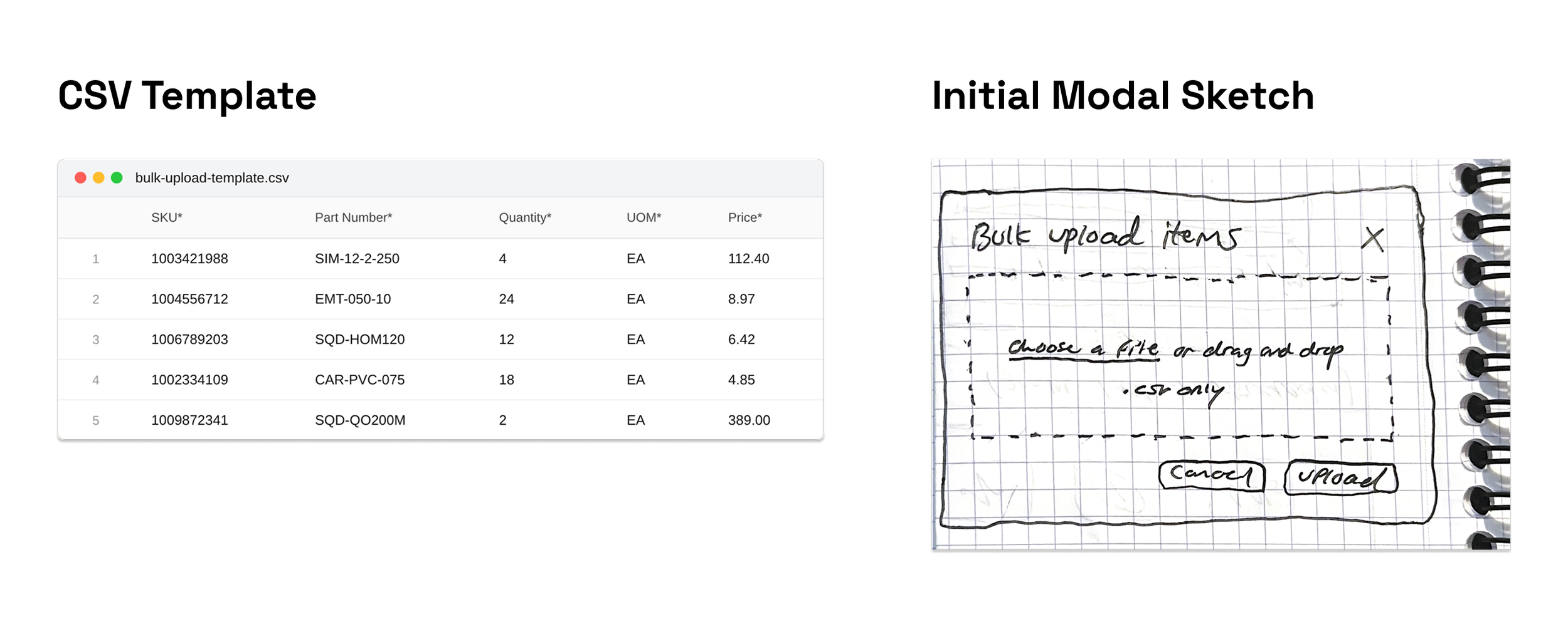
The team already used spreadsheets. Among the input formats considered, CSV had the lowest behavior-change cost for a team that was already stretched thin. The decision that mattered was strict template versus flexible mapping. A flexible system that tried to interpret the user's own spreadsheet would have meant column-mapping logic, fuzzy matching, and a long tail of edge-case bugs. A strict required template moved validation to a single predictable step: download the template, populate it, upload it back. T
The Solution
MVP Happy Path (Success)
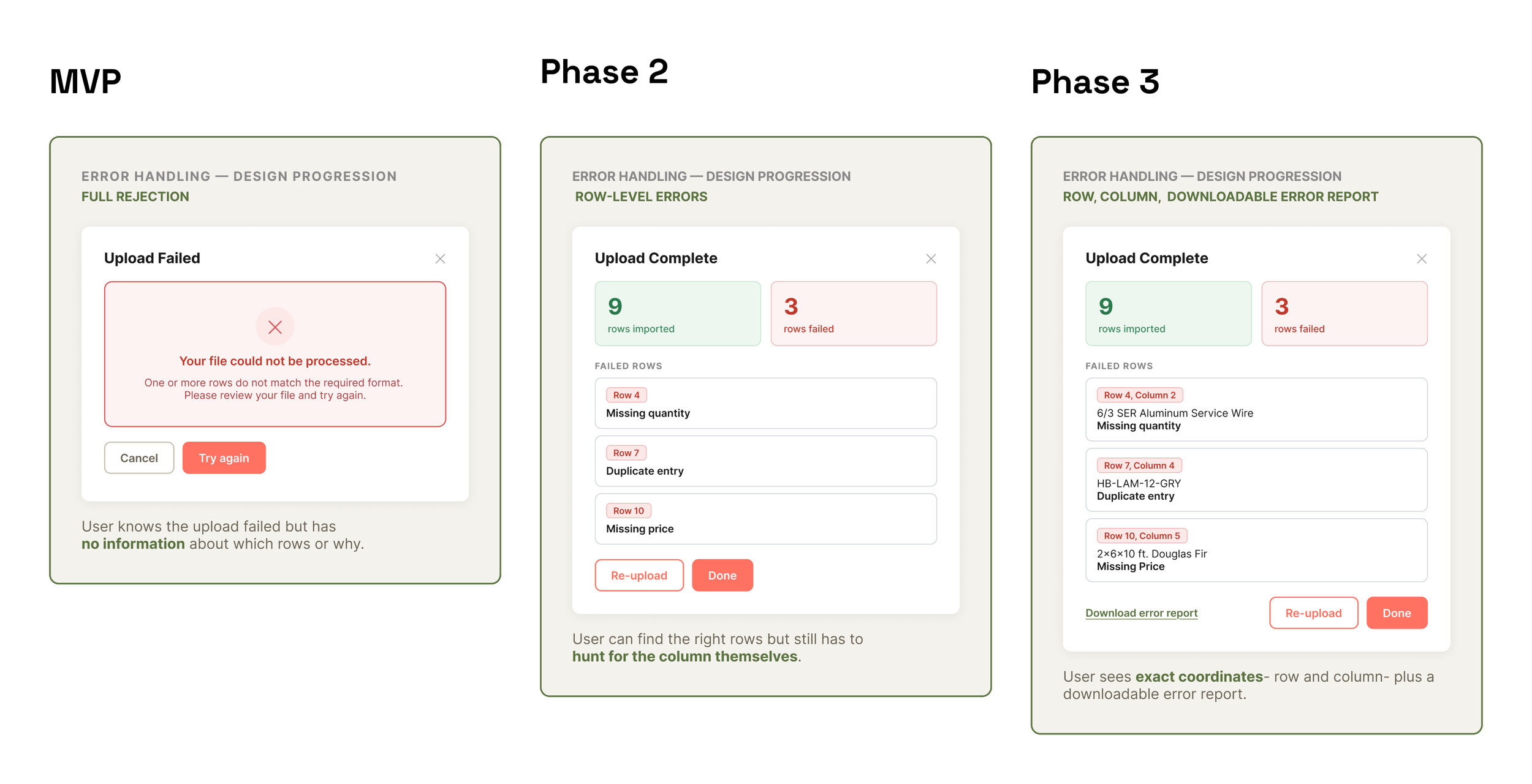
Error Handling
Impact and Reflection
This new process shipped, and the team picked it up immediately. The RPA bot went untouched from day one and was decommissioned within a month.
A quote that took 45 minutes to an hour now took 30 to 45 seconds.
Quote-to-order conversion increased by 35%.
The two weeks of shadowing did more for the design than any review cycle. They were what made it possible to argue for a strict template over a flexible one. I had watched the team work around tools that didn't fit their job, and I knew which tradeoffs they would actually accept.