UX DESIGN CASE STUDY
Skip the Call, Text Instead
| My Role: | Lead UX Designer |
| Company: | The Home Depot |
| Project: | Text 2 Confirm (T2C), Pro Account Purchase Authorization |
| Timeline: | 4 weeks |
| Methods: | End-to-end flow design, SMS UX, stakeholder communications |
| Deliverables: | SMS interaction flow, UI screens, AI-generated visual storytelling |
The Challenge
Pro Account customers at The Home Depot often make large purchases on behalf of a business. Those purchases require sign-off from a designated approver, but the system had no formal mechanism to capture it. Associates had to call the customer.
That meant approvers were fielding unexpected phone calls mid-job or mid-meeting. Associates were stuck waiting, sometimes following up two or three times before getting an answer. Meanwhile, orders sat in limbo for hours.
The friction created real problems for high-value B2B transactions:
Orders were delayed
Approvals handled inconsistently
No paper trail or confirmations
How do we give Pro account approvers a fast, reliable way to authorize purchases without requiring them to be at a desk or on a call?
Understanding the Users
Text2Confirm (T2C) introduced a two-party interaction that hadn't existed before. The system triggers an authorization request automatically when a Pro purchase is initiated. The Pro Account Approver receives it and takes action, usually on a job site, in a meeting, or away from a desk phone.
The approver was the critical user to design for. They needed enough information about the purchase to make a confident decision, but they were likely busy and and not expecting the message. The existing SMS had no follow-up screens or clear next steps. The approver had no prior context for what they were being asked to approve.
Harris D.
Pro Account Approver — Commercial Contractor
|
Profile
|
Behaviors Approves purchases between tasks
Relies on phone for business decisions
Rarely at a desk during the workday
|
||||||||
|
Goals +Authorize purchases without leaving the job site
+Keep projects moving without interruption
+Trust that the request is legitimate before acting
|
Pain points –Unexpected phone calls mid-meeting or mid-task
–No way to verify a request without calling back
–Orders stalling while waiting for approval
|
Workshopping the Design
SMS gives a designer very little to work with: no visual hierarchy, no branded button, no onboarding to set context. It is a plain text on someone's personal phone asking them to act on a business transaction they did not initiate. The message had to carry enough context for a confident decision on a small screen, and the reply mechanic had to be obvious on first read.
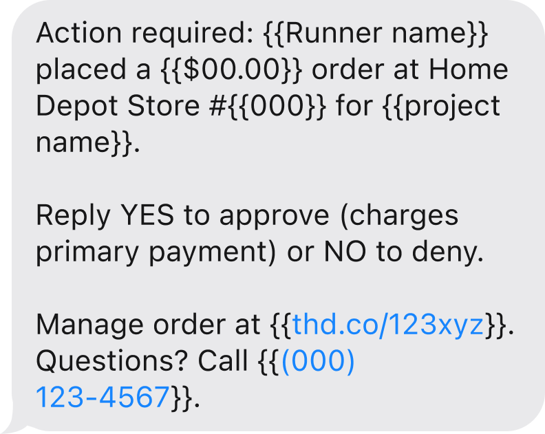
The design problem was a question of precision more than screen count. The message needed to surface six pieces of information:
Pickup person name
Store number
Purchase amount
Job name
Order short URL
Store phone number
All six fields had to fit on a small screen in an order that kept the approver reading until they reached the reply instruction at the bottom.
| Option A | Option B | Option C | |
|---|---|---|---|
| Message |  |
 |
 |
| Word Count | 35words | 35words | 43words |
| Read Time Assumes average reading speed of 220 WPM. |
10seconds | 10seconds | 12seconds |
| Characteristics |
|
|
|
The Solution
Trigger. When a Pro purchase is initiated, the system pulls the approver's number from the Pro Account profile and sends the SMS automatically. The associate doesn't need to call or stay on the line. The order moves into an awaiting-approval state until the response arrives.
Message. The SMS answers the approver's immediate questions before they think to ask them - what store, what amount, who is requesting, and what to do next.
Response. The approver replies YES or NO. The system captures the text, updates the order status, and notifies the associate at the register. Edge cases are expired or duplicate requests. These were resolved with setting up a request-blocked state so a stale approval or denial could not be re-triggered.
The full flow covers four system states across the approver experience: approved, denied, no reply, and duplicate.
Prompting the Story
Once the flow was designed, I needed a way to help stakeholders feel the interaction. A wireframe of the message structure doesn't communicate where the approver is when it arrives, or what the rhythm of the conversation looks like in the field. To bridge that gap, I built a short visual sequence using a chain of generative AI tools.
Claude wrote the image-generation prompts, specifying environment, lighting, body language, and device interaction for each persona.
Google Gemini rendered the photorealistic stills.
LTX Studio animated them into a five-second loop that played in the stakeholder review.

Generated persona shots used in stakeholder presentation
Impact and Reflection
T2C shipped to production. The AI-generated visuals helped align leadership around the user context early, and the design moved through review without significant revision. Designing for SMS forced a kind of discipline that screen-based UX does not usually require. With no layout system to lean on and no visual cues to mark importance, the message had to rely on word choice and field order alone. The constraint clarified what the message actually needed to do, which turned out to be less than I had assumed when I started.