
UX DESIGN CASE STUDY
what the data couldn’t tell us
| My Role: | Lead Product Designer |
| Company: | The Georgia Bird Alliance |
| Project: | Roost LMS Instructor Dashboard |
| Timeline: | 2.5 months |
| Team: | 1 Designer, 2 Program Managers |
Go straight to the interactive prototype here, which will open a new tab in your browser.
CONTEXT: FLYING BLIND
high hype, low engagement
Members of the Georgia Bird Alliance (GBA) were very excited about a new e-learning platform. Initial signups were very strong, but the organization quickly realized the platform wasn’t retaining many users. Leadership needed to understand the drop-off to justify the ongoing resource cost and validate the tool's long-term value.
The User Reality: No Visibility
The organization needed to ensure the LMS was beneficial, but course instructors had no insights on why students weren’t using the platform.
THE PAIN POINT
Instructors had no visibility into who was struggling or where they were getting stuck. Without performance data, they couldn't reach out to students, making the LMS a stagnant reference guide rather than an active learning tool.

INSIGHT: THE AGGREGATED DATA ISSUE
”Vanity” Metrics
An audit of the existing reporting tools revealed the core issue. The system only provided high-level averages of time spent logged in, completion rates, and quiz scores. All of these metrics were grouped together and could not be filtered. At first glance they looked fine, but gave us no true value.
THE DATA
Analytics showed students began courses but dropped off after completing fewer than two modules.
User Sentiments
I conducted interviews with three course instructors to understand their workflow. The feedback was consistent: they weren't just frustrated by low engagement, they were concerned with creating more content that would yield the same outcome.
THE STRATEGIC SHIFT
We realized the dashboard shouldn't provide only grouped average metrics, but we needed more insight to evaluate the content effectiveness. We had to shift our mindset from “How are students doing?” to “Where is the content lacking?”
SOLUTION: DESIGNING FOR OUTCOMES
The final dashboard moved beyond generic metrics to focus on positive learning outcomes.
We designed two core views to empower instructors:
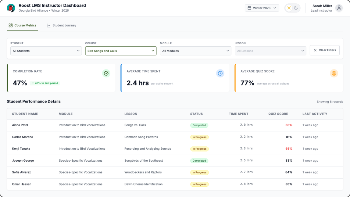
1. Course Metrics with Filterable Data
To solve the "aggregated data issue," we built more specific filtering, allowing instructors to filter down data by Student, Course, Module, and Lesson. This allowed them to determine whether a drop-off was a single-student issue or a pattern across the entire class.
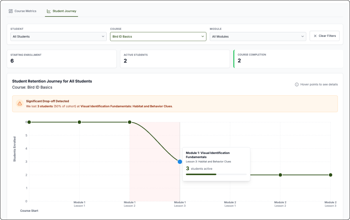
2. STUDENT RETENTION JOURNEY GRAPH
We designed this graph so instructors could quickly see where in the course students were dropping off. Instructors can use the filters to change the view of the graph to get a clear picture and gain insights about where and why students are dropping off. This highlighted potential issues in the curriculum, allowing instructors to see exactly where students were abandoning the course rather than just knowing that they left.
TESTING & ITERATION
We worked in two-week sprints, closing each cycle with a demo and structured feedback session with course instructors. Over four to five rounds, their input directly shaped the dashboard's filtering logic and the retention graph - early versions surfaced data but didn't make it immediately actionable.
One piece of feedback proved particularly important: an instructor pointed out that the default landing view was scoped to a single course, which meant they'd have to navigate before seeing anything useful. They asked for an all-courses view as the default. It was a small change with a big impact - it reframed the dashboard from a drill-down tool into a genuine at-a-glance overview, which was the whole point.
Results & Future Vision
By shifting the focus from generic reporting to actionable insights, the instructors had the data they needed to ensure that the LMS was a valuable tool for the organization.

From “Flying Blind“ to “Flying High“
Completion rates increased from 15% to 60%
After instructors gained visibility into where students were dropping off, they were able to identify and revise underperforming content. The result was measurable - student completion rates climbed from 15% to 60%, validating that the problem wasn't student motivation, it was content that couldn't be seen or improved without the right data.
Content Optimization
Instructors now had the information that ensured they developed content that was both valuable and accessible to make sure students were able to stay engaged in their learning journey.
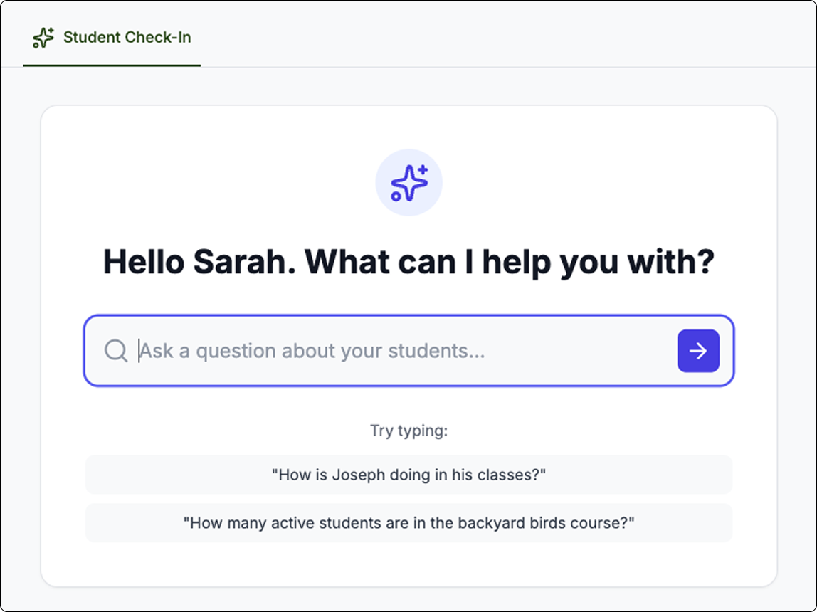
Future Vision: AI-Powered Performance Analysis
concept
While the improved data gave a much clearer picture of student’s performance, I proposed we take that a step further and implement an AI Agent in the LMS Dashboard that allows instructors to quickly check-in on students progress before deep-diving into the data.
Strategy
Budget constraints limited this to a very conceptual exploration. Should more funding be available in the future, I provided an AI-Roadmap sharing an implementation strategy.